Skip to main content
Home
Locomotives
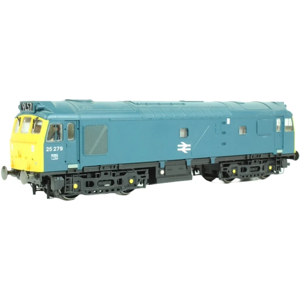
Bachmann 32-401 British Rail Class 25 25279 British Rail (Blue)
Bachmann 32-401
British Rail Class 25 25279 British Rail (Blue)
Left Front Three Quarter View
|
© Hattons
Image Viewer
Left Front Three Quarter View
|
© Hattons